Friday, 27 October 2017

Fun With Particles and Dynamics

This session on C4D focused specifically on exploring the possibilities of particle systems and dynamic systems. The ability to create a randomised effect can give unique and believable effects to animation. 

The benefit of using 3D software to generate imagery is the power of randomisers and the ability to alter things quickly and consistently.


Optical Confusion from Sophie Wales on Vimeo.

Postmodernism - Randomized effects from Sophie Wales on Vimeo.

GMUNK https://www.3dfordesigners.com/

Since my previous Workshop I have had a look into other C4D design inspirations and played around with these effects more to create more outcomes.


negative displacement from Sophie Wales on Vimeo.

displacer 2 from Sophie Wales on Vimeo.

cloth effect animation from Sophie Wales on Vimeo.

Thursday, 26 October 2017

Motion Go - Fun With Frosting

As a fun activity for deadline week we decided to be a lot more freeform and creative with a stop motion of a cake decorating. We all collectively brought in decorating materials and determined a perameter of where to start our animation. We also worked out the correct ammount of frames to use for the lead-up to the cake and the actual decorating of the cake.

This was a fun, short activity that got me in the mindset of stopmotion and its possibilities and was fun to work in a larger colaborative group for a change to our usual individual work.

Cake Shoot with Audio 1080 from Motion-go on Vimeo.

Friday, 20 October 2017

Classic Comedy Can Cultivate Creativity


Actions speak louder than words. Design I feel works in the same way, we should't need to use words to convey a message if you can frame and animate it well enough.

As a fan of clever cinematography and classic gag humour, I found this video a great visual representation of how classic comedy can be a good way to think about framing and placement. The methods implored in these early gags are timeless and would be a good thing to implement and consider when doing story boarding for design and animation in my own works.

J-pop Music Video Inspiration

Japanese music videos have been making a lot of fun use of animation and rota scoping within the past few years. The style and feeling these techniques give a surreal environment and I would love to develop my style to create something with this method or feeling These examples in particular I was inspired by:

I plan to do a more minimal mimic of the first videos face mask concept as it gives me a lot of fun to play around with visuals in Adobe After Effects.


Thursday, 19 October 2017

Motion Graphics Club - Geometry

Today we learnt how to connect audio directly to a shape or object within Adobe After Effects so that the shape will visually react to the audio frequency. This technique is super handy for music video visuals or keeping to a beat e.g. a beating heart audio.

The idea was to just play around with the potential of this ability and have a collection of creative pieces from the group collected together. This task was super simple and fun but has lots of potential for upcoming projects.

Geometry Animations from Motion-go on Vimeo.


Rotascoping - worth the effort?

Rotascoping is a time consuming but rewarding process. In a 4 hour workshop I created and finished a second of animation that is loopable. This process is great as it gives the oppetunity to make figures animate without the same complex process of traditional animation.

Using the combination of live action footage and vector masking, digital rotascoping is a lot more consistent.

When picking assets for my rotascoping project I had two very clear objectives: A human hand or profile due to their distinct appearance. Its crucial to have very obvious shapes due to the nature of cut out method of rotascoping.

I also explored interesting colour schemes and decided on this one:


the footage I took I made a frame by frame contact sheet to give an idea of what I created. I intentionally over-animated my finger movement in order for the shape to convey better over a flat mask.
 
This is my result from this session but i would love to explore this area more:

The Magic of Rotascope from Sophie Wales on Vimeo.

These are other sources that inspired my work before my creation session.

Young The Giant: Something To Believe In from Drew Tyndell on Vimeo.


I have since gone back to rotoscoping my hands as a continuation from my first animation using the same colour scheme and style.


mayhem rotoscope from Sophie Wales on Vimeo.

Monday, 16 October 2017

Wilsons Republic

Wilsons Republic was an inspiring conference of various artists of different professions. They each took their time to reflect on their work surrounding the theme of the event which was "Roots".

The first speaker of the event was an artist called John Lee. Growing up a huge sci-fi fan watching shows like Thunderbirds and Captain Scarlet, he was enamoured by Practical effects in film. Not being established like it currently is, he pursued his passions independantly creating model scales and photographing them before being invited into the industry for his first project 'The wind in the Willows'. His most well known works include The Martian, Star Wars Episode 7 and Into the woods. He said the reason he was hired was simply because he was seen as " Enthusiastic, Young and Cheap.

His speech reminded me of the love for practical effects and how irreplacable they are.

The Second Speaker Was a Type Designer. Tom Foley went through the history and roots of type. Originating as cave paintings and the evolution of scribe from egyptian symbols to the more modern depiction of the alphabet. He mentioned the progression from hand written scribe to a more legible and clean format of font and what makes a strong shape for type.

His indepth description into the anatomy of letters made me a lot more considerate of the general width and different aspects of my individual characters.

Talk three was about Eve Warrens work. Working currently as a packaging designer, she talked about her work within the local community and the importance of colaborating with other designers and the power of play.

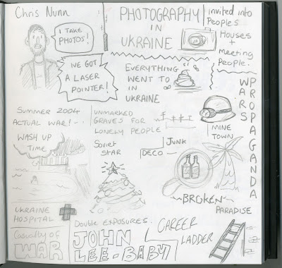
Chris Nunn was next, a war photographer who worked in Ukraine, he tried to avoid conventional war photography and focused on the people living within the war zones. He photographed young summer love and all the optimistic and peculiar people he witnessed. He also did a series based within the hospital in Ukraine as something to do while recovering from the war damages he had taken.

His story was interesting and gave a more authentic and intimate representation to the wars of ukraine in 2004. His adaptive ability to immerse himself into social situations and create a more intimate narrative has inspired me to try and create the same level of intimacy in my own work in the future.

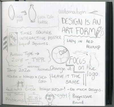
The fifth speaker was a James Summerfield, Coca Cola graphic designer. He talked about the origins of Coca Cola and how it pivoted from its intended creation into what it is today. He discussed the values of Coca Cola and the messages they like to portray in their marketing and design. They showed how they innovated older concepts from Coca Cola and gave them a new breath of life with a more modern approach.

The final speaker Craig Oldham was a colourful character who liked to show his pride in his upbringing and culture. His work he showed was very personal and drenched with political context. he used the term "Hairdressing design" to describe work that was all style with no substance. This statement stuck with me along with his idea that anyone can become a graphic designer in the right political movement. It doesn't have to be clean or orderly. It's about conveying a visual message with impact.

Each speaker gave a wonderful insight into their area of expertise and I left the event feeling very invigorated for the new year at university.

These are my scribings from the talks of the day:


Thursday, 12 October 2017

Self Publication - Zines

This session we had to listen to a lecture on the values and disadvantages of zines while scribing. It talked about the availability of out-of-print books and the pros and cons of self publication. The idea of this exercise is to graphically make notes to reflect on later relating to create a zine on.


Based on the notes I made, I tried to make a narrative. The idead of intimacy with technology fascinated me and gave me strong visuals of an imagined technology revolution. I used eastern propaganda visuals for inspiration.


Collaborating with a partner, we worked out our strengths between us to create a zine of both of our ideas. We both themed our zines around futuristic elements however his work was more punk influenced. I loved his use of colour and I think our styles complimented each other well already. We decided to continue the themes of encouraging technology as an independent artist. With these themes in mind we mind mapped and created a mini zine with the message of encouraging the idea of technology and making your own content.


Continuing with the themes of zines, this workshop was with Nick. We had to bring in an important object to us.  with this object we constructed an entire zine based on the shape, the visuals and what we thought the object would say to us.


I have since the initial workshop worked on a variety of personal zines as a hobby.


Monday, 9 October 2017

C4D - from 2D to 3D

Today in Cinema 4D I continued my practice and development to create an animation.

This session I focused on pulling in 2D elements from Adobe Illustrator into C4D. I did this by first creating my assets in Illustrator, ensuring the file format is an illustrator 8 file or earlier. Things to consider when importing Illustrator files into C4D is that the shapes have to be simple. Once the Illustrator file has a lot of shapes or lines it can often not convert very effectively into C4D.

Once in C4D you can add texture and depth to the shape you have created ultimately making it exist on a 3D plain as well as adding any additional pieces or environmental settings such as background, lighting and camera rigs.

logo from Sophie Wales on Vimeo.


Cloudy Day loading screen from Sophie Wales on Vimeo.


Wednesday, 4 October 2017

Motion Graphics Club - Self Introduction

During this years motion graphics club, we decided it would be fun to try techniques and do activities outside of the standard work criteria. The first project we decided to do was an introduction reel giving a sense of our personalities and our names. This could be shown in a show reel to a potential employer.
I decided to try a new technique of layering 3 different drawings of the same image on top of each other. when they are animated it gives a sense of movement despite being the same image.

The only restriction for this piece is that it has to be 5 seconds and consist of black, white and another selected colour, I chose red.

Anatomy Of Me from Sophie Wales on Vimeo.