Friday, 21 September 2018

Liverpool Gallery Trip

I went for my first ever trip to Liverpool yesterday. I made two different stops at the Walker Art Gallery and then the Tate museum. though the weather wasn't fantastic it was a great day non the less.


The Walker Art Gallery was an interesting bit of architecture, historical and contemporary work often linking to each other through winding rooms on the upper floor. As a big fan of art history I enjoyed the concept of walking into individual rooms and areas dedicated to the various historical eras of art.

The main contemporary exhibition at the gallery was the John Moores Painting Prize one that is set up every two years and is open to the community and anyone can put their work forward to be used in the exhibition. The voting for the winner is also a community driven scheme using an anonymous poll technique. Due to the variety of work and techniques it made for a diverse collection of art.

My personal favourite piece was Delphine Hogarth - 'French Summer' but I could't give an exact reason why.
Image result for watercolor paint


After grabbing a quick coffee and preparing myself for the rain I walked over to the docks to visit the Tate Gallery, a place I have wanted to visit for some time now. It was good to finally be able to explore it.

Inside the Tate I got the opportunity to visit the current exhibition Life In Motion.

Egon Schiele self portraits were the most fascinating to me. The way you see yourself is often reflected through your art and I thought it was a shame that they were almost overshadowed by his other work with erotic imagery and experimental photography.

I enjoyed the photography but I felt the space had too much on display and that took away from the experience of individual pieces. The work reminded me of my own experimental photography though so I felt a strong connection towards the works technique.


Related image
Egon Schiele - self portrait masturbation 1911


A sneaky peek at the day:


Wednesday, 29 August 2018

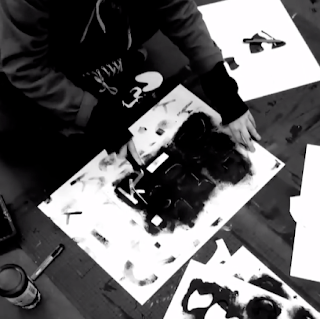
Abstract Stencil Typography


Menhera Tshirt Design Contest

A Instagram artist I follow did a Tshirt design competition fitting to the theme 'Menhera'. This is a style and theme I was already familiar with and a fan of so I thought it would be fun to enter into the competition. There were guidelines to the design itself only being able to use a total of 5 colours excluding any use of gradients due to the printing technique used. There was also a grid size limit which could not be crossed for the design placement. Beyond these basic rules, I was free to do whatever I felt fit the theme best. For those who are not familiar with the term Menhera I put a fitting definition found online below:

Menhera (メンヘラ)* is a japanese slang term derived from “Mental Healther*”. It became the spark of a sickly cute (病みかわいい) aesthetic which takes the abiguous usage of the word “sick”, like as an insult for something nonconformist, literally as reflection of the social stigma which still hides behind the surface of “kawaii culture”. The imagery of this style is shown with contrasting themes like cute objects and teddy bears with more questionable things such as gore, death and medical themes.


These are a few different colour pallets i made based on medical themes. I made emphasis on pinks, greenish blues and reds. Colours I associate with medical wards and wounds. I made sure to include softer colours to keep with the cute style associated with the theme.


I came up with two different designs that fit the theme of the contest both fitting in different ways. The first design I did was a sickly sweet 'get well soon' bear. It features 80's anime inspired eyes, bandages and cute medical themes. The second one took a very different approach to the same theme using a more mature almost grotesque schoolgirl with a visual representation of mental health through head trauma.


This competition was really fun, I always enjoy working with limited colour schemes and working with styles I don't get to use so often.

Friday, 8 June 2018

Mood Board Madness

On my computer I have a little folder just full of everything and anything I find inspirational or visually inspiring. 

As the size of it is increasing I thought it would be nice to create digital mood boards to publish these for myself and other people to take inspiration from. As from now on there will be a link to it in my links section of my blog. or if you are too lazy to go there there is also a link here:

My mood boards

Here's a little sneak peak to get you interested...


Doodle Dump pt 5


Tuesday, 5 June 2018

Data and Analytic Motion

This task was to create an animation to be used in the heritage quay information point at the university. This info graphic would be one of many put together to give a detailed and visual data description relating to the extensive archive on campus.

Before starting my section of the project I looked into pre-existing infographic videos for inspiration like this one below:


This video truly highlights how interesting you can present data and facts through dynamic movement and colour. The concepts and themes in this video gives great inspiration on the kind of work I could produce around data relating to Heritage Quay.


The fun aspect of this task was ensuring I stuck to the key; a set of 'rules' of the Heritage Quay design book. I always like design restrictions as they foster more problem solving.


The key consisted of alternate colours, fonts and the context and positioning of which the logo can be place. these restrictions are crucial for large corporate companies and brands to create a familiarity and brand recognition.


Before taking any of my work into Adobe After Effects I first created layouts, patterns and mood boards for the animation i wanted to create. Laying out art boards like storyboards for the individual scenes I would have to create. With the layout of my animation organised I can easily proceed to create my animation in a shorter amount of time.


The animation I created:
infographic test from Sophie Wales on Vimeo.

This animation was then added into a compilation of other peoples work so the last transition is actually made transparent to allow for the next animation to fall into place. This allows the transition from one animation to another to look more seamless. This is a very good trick to use in larger projects with multiple peoples work.

Heritage Quay Final Movie - Group 3 from Motion-go on Vimeo.

This infographic was made using information and assets from the Football Museum Website and the only restriction to the work was to use a specific shade of green, Beyond that any colours or styles were usable in ten second segments of animation.

When working on my assets I intended to use two separate scenes, you can see the transition layout in the lower image. this is done to give a more smooth and natural transition from scene to scene.


I got one quote and since the text was quite large I split the information between two ten second compositions that would be next to each other in the end composition that features everyones work.

WW1 Football infographic from Sophie Wales on Vimeo.

this is the version with my work included with everyone in my group:

Group C - The Past from Motion-go on Vimeo.

Thursday, 31 May 2018

Wallpaper Colaboration

I decided to work alongside an aspiring illustrator/animator to create a series of fun patterns that could be used personally or for marketing. 

Cornelius and Onion is an original created series by Jcrow. To work on the collaboration I asked for some sketches of the character Onion to work with. This character is small, quirky and full of character so I thought it would lend well to a pattern as well as giving freedom for variety regarding posing and emotions.

See their work here:
https://www.instagram.com/the_jcrow/
https://www.youtube.com/channel/UCLkN7DfWxCAWz_9-U4xfrlQ

Based on the work previously done by Jcrow they tend to use a lot of bright colours or pastels with thick lines. I wanted to stick to the feeling given by the work of the original artist in the patterns I made.

The sketch I got given was the one below, hand drawn and scanned onto the PC before being sent to me:


I then took these sketches into Adobe Illustrator to vector them making them more appropriate for large scaling or morphing. I made a large variety of different colours and styles all fitting with the theme of the series and character. 

Making a few variations meant there would be more variety for Jcrow to work with if needed. I made most of my patterns scaled to a standard size of 1920x1080 but can easily adjust them if they are needed for a more specific use.

All of the patterns I made are below but due to the character not being owned by me I have chosen to watermark the images: