Monday, 31 October 2016

Inspirational Quote

In order to familiarise myself with the university library I was asked to seek an inspirational quote. The quote I chose is from a very inspiring and down to earth book on trials and tribulation you may come across in graphic design.

Adrian Shaughnessy states that "Too often, an obsession with originality leads to a sort of creative timidity. the bold designer, on the other hand, borrows freely and adapts from sources in precisely the way artists have done for centuries"(How to be a graphic designer without losing your soul)

I feel all artists should reflect on this quote at some point in their life as we often find ourselves uninspired and unwilling to seek other art out for comparison or guidance in fear of being a copycat. This quote inspires me to seek help in others work and implement it into my own.

Wednesday, 26 October 2016

Design Manifesto Poster

While being introduced to Indesign we were given the task of replicating a Gutenberg bible text layout combined with the 'Van de Graaf Canon' page layout. With the combination of these I was tasked to create a poster of my personal manifesto I had worked on previously.


Design Manifesto

Manifesto - a public declaration of intentions, opinions, objections, or motives, as one issued by a government, sovereign, or organisation. 


As a designer, you have to think of the amendments and rules youcan set yourself, usually this comes in the form of a manifesto. In this session we were asked to analyse First Things First by Ken Garland and co-designers (1964) then create our own personal manifesto inspired by it.


After going through and making notes related to this manifesto we were given the task to make our own:


Here's what I know for sure, I will never stop being creative. My art and creations will matter to at least one person. That person is me.
 I love BOLD lines, colour and ideas. I love the chaos of a project just as much as I love the abundance of sticky notes to control it.
 I believe in taking any chance I can get. Even the ugly things can be beautiful. I dont want to live in a world restricted from creative freedom. I want a world where being an artist is seen equal to more academic jobs. 
I am committed to never getting strung up on one failure when there are so many accomplishments I have already made. I will take pride in my failures and will value them till they become a success. I am committed to proving anyone who says something is impossible otherwise.


I will restructure the way I see my work. No longer will I make shortcuts to get a result quicker. The process is the fun bit.

Bitmap use Indesign

In one of our technical sessions we were given a tutorial on ways we could create poster style graphics using bitmap and Indesign. This method is very reminiscent of pop art or punk posters.

Exploring Huddersfield - Sense of Place

When I initially got my brief for Sense of Place I thought the best first step or action would be to go out and explore for myself. The best way to get a 'sense of place' in the broader sense is to go out and do the primary research. Here are a few contact sheets from the day:


Tuesday, 25 October 2016

Day Trip - Yorkshire Sculpture Park

As a group we went on a trip to the Yorkshire Sculpture Park. This was a great opportunity to not only interact with the environment myself but helped to inspire my own work in sense of place. On the trip I took photographs and sketches as we travelled around. The park gave a great sense of place using natural spaces combined with artists installed pieces to give a surreal man vs nature aesthetic overall.

I wanted to really immerse myself into the environment visually when taking photographs so often found myself looking for shadows, shapes, colours and ways to photograph. I wished to experiment with a few different techniques that were brought up in previous lessons as well as getting a start to some of my own work pieces. As part of my Sense of Place project I ensured I had a GPS tracking the routes I was travelling for the day. Here are a few unedited images I took on my journey.


The season is on my side as I get a lovely array of shades of leaves and colour in the environment. I wish to create a colour pallet of the day for my Sense of Place project and these autumn colours will play heavily into it.


Bradford Media Museum - Status 2.0.

In my spare time I travelled to the Bradford National Media Museum to find a piece of  artwork relevant to my work. This art was a piece called Status 2.0. created by previous Huddersfield University student Chris Kemm.

'It collects and samples thousands of different emotions expressed online and represents them with a carefully chosen colour. The artwork creates a constantly changing reflection of the mood of the internet.' As I wished to associate colours with emotions and places I travelled to view this piece of work for myself, in hopes to inspire my own work in my current project 'Sense of Place'.

While travelling to and from this space I recorded my travel to and from this place using a GPS tracking device.


One True Sentence

In this session we were taught a writing lesson as a way to loosen up and explore how to think and expand on the initial idea for an essay. We did this using a writing technique that helps to develop a basic concept and building upon it.


1: Write one (short) true sentence. As fewer words as possible.
2: Add a description of the content
3: Add a description of more content
4: Give the content an emotional quality
5: What is going to happen next? - in context to your essay question
6: What happened before? - ion context to your essay question


The one we constructed in class was based on the image below. From this simple bit of information we had to expand on it using the formula stated to get more out of the image.


A brown bear sat in a chair.
Bear, sitting comfortably.
Cosy bear sitting comfortably.
Cosy bear sat on an outdoor chair.
Silly bear chilling in an outdoor chair.
Silly bear sat waiting for the circus.
Lost and weary bear waiting for the circus.


In order to prepare for the written paper we were asked to bring in relevant items and books that could be used as a starting point for the essay. I decided to bring in 2 books that could be relevant to the essay question: ' Discuss the effects of subcultures on influential graphic designers and/or animators.' 


The first book I brought in was 'Subway Art' - Henry Chalfant and Martha Cooper 2009. This is a large format, graphic book focusing heavily on imagery and layout. There is little in terms of writing making a 'pure' example of subculture personified into a book.


The second book I brought in was 'XXX: The Power of Sex in Contemporary Design - Sarah Dougher and Joshua Berger 2003. This book shows a variety of commercial based graphic design with sexual themes.


To attempt this essay technique again I based the formular on this book. The results are as follows:

This book is about selling sex in contemporary art.
This explicit book is about selling sex in contemporary art.
This Bold explicit book is about selling sex in contemporary art.
Shamelessly explicit book about selling sex in contemporary art.
Shamelessly explicit book about selling sex in contemporary art to provoke questions of morals and subcultures.
Shamelessly explicit book about selling sex in contemporary art to provoke questions of morals and subcultures due to its lascivious and primitive nature.


This is a good starting point for an essay if struggling with writers block however it may not be ideal for every situation.

Programmed from birth?

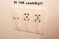
When visiting the Bradford Media Museum for another project I happened across the current exhibition there called ' In Your Face' exhibiting from 23 July - 30 October 2016. This exhibit explored media or interactive pieces and how much information we get from faces.


This exhibit discussed that babies recognise faces as soon as they
are born as it is usually the first thing they look at. This makes babies good to study how adults read faces also. A test was created to get reactions from children using three panels. Each with different levels of characteristics of a face on. The results often found that the 'uncanny' variant of the panel being the least popular. Proving this is a natural occurrence even less self aware beings have.

It also stated that our brains are programmed to look for faces so much that we sometimes see a face that isn't really there such as in clouds or objects. This is called Pareidolia. Computers also pick up on this also which is why sometimes we end up with those terrifying face swap mishaps. An artist who used this to his advantage would be Shinseungback Kimyonghun who mounted a camera to the museum to look for faces in the sky. This used the computers face recognition program to register images of what it sees to be a face in the clouds. His work simply called 'Cloud Face'


I find it interesting that media has been adapted to pick up on human-like characteristics in the same way we do. I wonder if programs will be created that will also be able to distinguish 'fake' from 'real' in the same manner.


Friday, 21 October 2016

Live drawing

In this session we were tasked to draw the inside of the Creative Arts building from life. The Interior focused on perspective and strong lines that we could see. The task was to look at the interior of the Arts building and find interesting patterns and shapes to draw from. As the building is Modern with an open structure it allows you to see support beams and core structures,these are great to draw as you can pick  up on a lot of shapes and edges that otherwise wouldn't be there. The materials I used were pencil, fine liners and grey scale pens. I tried to use as many techniques I could in the time I was given.


Thursday, 20 October 2016

1984 illustration to animation

Using illustrations combined with music I am able to create a dramatic piece of animation using After Effects. I planned out key frames from the book '1884' by George Orwell using a vivid and basic colour pallet. Here are my results:


1984 trailer from Sophie Wales on Vimeo.

Tuesday, 18 October 2016

Surrealism and the Uncanny Valley

Surrealism was founded in and around the 1920s. The world war 1 was over and to distance themselves from reality artists started to explore how to portray dreams and reform the world differently through the means of art. 

Andre Breton a french poet and participator in the Dada group was the founder of surrealism and wrote the surrealist Manifesto in 1924. In which he discussed the idea that surrealism is 'pure psychic automatism' This brought about artistic practices like automatism - to access your subconscious mind through a creative process. Though intended to be used as a medical practice, this brought a whole lot more for the artistic movement. Poets created automatic writing practices followed by artists attempting to also tackle the subconscious visually through automatic drawings.


Andre Masson - automatic drawing


Max Ernst, The Elephant Celebes (1921)

"it cannot be born from a comparison but from a juxtaposition of two more or less distant realities" - Andre BretonThese practices were not only portrayed in writing and art but films such as Un Chien Andalou are famous for being surrealist works. The order of the movie is nonsensical but is chopped in a way to create uneasiness in the watcher through contrasting themes. the most famous scene in this movie features a man gazing at the moon caressing a razor on a balcony. The next scene shows the closeup of a woman being held by a man who then slits the womans eye with a razor as she stares ahead. This short segment was Inspired by a dream Buñuel had where a cloud sliced the moon in half  "like a razor blade slicing through an eye". 

Common themes seen in surrealism include: The human form, organs, flowers, chance encounters, clouds, sex, madness and death.


Uncanny Valley


This is a phenomenon that is appearing more and more in the 21st century with the advancement of technologies such as 3D rendering and robotics. It is the idea of seeing an image that isn't completely ' right' by our own standards. You often notice this in attempts of hyper realistic work where something is considered 'off' or unnatural. This response can even be had when looking at identical twins.


The idea of seeing an uncanny humanoid can trigger a instinct fear of being in danger of dying. Humanoid robots for example can appear normal in form but show no emotions similar to a corpse or even a zombie. This is why common fears for people to have are of clowns and puppets both with inhuman characteristics. If you wish to try out firsthand the feeling of uncanny, try out this simulator cubocc girl where a interactive image of a human like being follows your mouse.


As a creator it is important to make sure you dont fall into the hole of uncanny valley if trying to make appealing characters. Movies such as Tin  Tin and the Polar express were deemed too uncomfortably realistic and ruined the experience for the watcher.


I feel in recent times the line between real and fake is being blurred as technology advances. An example of some amazing special effects would be this galaxy advert. Using 3D rendering technology and face doubles the creators completely created a feature using deceased actor Audrey Hepburns likeness to create an otherwise impossible advert.


How long will it be before humans and 'other beings' are indistinguishable? I Feel nothing will stop these technologies from progressing but will there ever be a point where we won't consider humanoid like being to not be uncanny?

The Man in the Bowler Hat / Coffee to go

While Exploring the history of surrealism I came across a short video just going over basic themes in Surrealism with famous actor Peter Capaldi, Though not relevant to my work I found it to be a short and interesting video as it mentions a lot of popular themes of the surrealist movement.


The Man in the Bowler Hat by Rene Margritte is a well known surrealist piece that i think would be fun to replicate. The face being covered is supposed to provoke questions and give a sense of mystery and whimsy. To adapt this image for my own work I want to focus on it being otherworldly. To create similar likeness in shapes I want to make the censorship of the image to be of a coffee cup to modernise the image. With modernisation in mind I thought it would be fun to add the phrase " can i get a venti human to go?". This plays with the idea of an alternative universe where coffee can order humans from a shop contrasting to the reality of the situation. It was just a fun little idea/sketch I had in mind while exploring work of surrealist artists while reflecting on my own current project. I made a quick sketch which at some point I would like to recreate to a more professional calibre later. I wish to use warm tones on the 'character' to contrast the cool colours of the clouds. It is common to see re-occurring themes of clouds in surrealistic works as it suggests a dream-like state.


Sunday, 16 October 2016

Essay Brief First Look

To prepare for the written essay I annotated the brief ( Taking notice of key words and deadlines the goal ) to develop a better understanding of what is required for the essay. The essay has three potential questions that can be broadened and explored. These questions can be looked at in a multitude or different ways. As groups we annotated and created mind maps or notes for each question. I will continue to expand on these ideas in upcoming lessons and spare time.


Thursday, 13 October 2016

Jonathan Lindley

We had a talk to a previous student at the university. He discussed the importance of theory in Graphic Design while showcasing some of his own work.


He has worked with bands for the most part doing music videos and alternative graphics.

Wednesday, 12 October 2016

Book Of Lies

In this lesson we created a collective information video. Each individual member of the group answered  a simple questionnaire which consisted of lies either about ourselves or others. Once all of the lies had been collected, each individual student was photographed. The images were taken in an unflattering mugshot style to remove a sense of personality. Once the images and lies were done they were run through an algorithm which would randomly match one persons quote with another persons quote. 


This technique creates a whole new context to each image as you cant help but associate the imagery with the text. This technique can be used in a variety of ways to provoke a new emotion or response to the original context.

The Medium is the Message

The format something is given in can be just as important as the subject matter. This can often leave a much stronger message than the actual product itself. Form and content are considered distinct aspects of what makes art and design.


A strong example of this would be an art piece by Shepard Fairey called 'OBEY' 1999


This image featured a famous wrestler, AndrĂ© the Giant, and the phrase 'OBEY'. The phrase was influenced from the imagery in the john Carpenter movie 'They Live'. This movie uses strong themes of subliminal brainwashing and manipulating people in the masses. What started as a small niche joke soon evolved into a viral phenomenon as the imagery appeared in different locations with the intent to provoke questions in people about their surroundings.


Guerrilla marketing is becoming more and more common today with fast paced living and shorter attention spans, making for some of the best marketing methods yet. This invokes the slogan of the brand KitKat by having a seating arrangement.  'Have a break, have a Kit Kat' is being figuratively given to you in the form of a seat.


To attempt this method ourselves we were given a small selection of newspaper clippings and were asked to create something with form or message. Our group decided to use images of pet dogs in the newspaper combined with traditional folding. We folded the images of the dog into an origami dog. This gives the contents of the images a 3D personification first and foremost then the content of the image is relevant.


Species of Spaces

To get into the mindset of how to visualise things in a different way i was set with the task of recording a personal memory in small sketchbooks. We had  to consider using maps, text or symbolism and the layout overall. The center of view had to be consistent throughout to keep the focus on one thing. This gives the viewer more information as they find themselves further away from the original subject matter.

The next part of the task was a collaborative piece of work. In groups of 5 we were expected to implement the 'stories' we had created in the morning together. Showing correlation in other peoples work with our own. We were given a long scroll to feature our work.

As a group we decided to lay out the scroll as a metro rail map. Making stations relating to things our work had in common. We used standard metro colours each rail line referring to each individual person. I was in charge of integrating each individuals person into the layout of the map. this was very much a trial and error process to make an aesthetically pleasing while retaining a realistic rail layout. Adding a key into the work made for a more visually comprehensible piece overall. Our mural relied heavily on the work we did separately as that is what was the basis of the map. This being the case, we made sure to display our folding books along with the mural clearly.

Our group was the only group to create a mural like this. Other groups played with the idea of panoramas, birds eye views and surreal layouts making a huge variety and perspectives on this task.