Wednesday, 8 February 2017

F YOU PAY ME - Intern Magazine

Alec Dudson; editor-in-chief of Intern Magazine came into Huddersfield University to discuss ways which can help you get into industries and a look into internship work and what it is like.

Before establishing Intern magazine, Alec had never working in any creative field. Having no skills related to the area he found himself interested in he opted to try an internship position. These are often considered daunting as an intern may not be paid and there is no guarantee that there will be a job at the end of the internship.The upside is it gives a good sense of what the company or area of work is like to gain valuable insight into a company or field.

Alec took two different internships. The first internship was a two month placement in Milan with a large architectural magazine company called 'Domus'. He found the magazine creation process interesting, but less so the subject matter. With it being a short term placement Alec soon moved onto another internship in london with Boat magazine. He was fond of how it differed from most magazines with better quality paper and interesting layouts. He worked in a small team of six people helping with photojournalism work and within a month and a half of his placement watched the team create an issue of the magazine. At the end of his well enjoyed placement he was sadly laid off as a small independent business couldn't afford to hire him. 

Time passed and out of an act of desperation Alec decided he would make his own job doing what he loved. He wanted to make a small independent magazine similar to where he worked. Before doing anything he has to ask a few questions on what, who would it be about and why would it be different?
Knowing the experience and stuggles of young interns traped in a cycle of uneployment and intern placements he set out to make a magazine that informs people about the world of work in internships. This magazine doesn't showcase artists already known but people still fighting for the spotlight. An important part of this project is that any work that is contribute is paid for as Alec stated " All contributers should be paid for their work, exposure for work is bollocks."

Alec also gave us some tips on CVs and how pursuing your interests will help in finding the kind of work that you are passionate about.

go viral - CV's are boring and repetitive. Trying to be distinguishable can soon be difficult in a wave of other designers. Søren Danielsen decided to up his chances and made a short 60 second animation in the form of a digital CV. It didn't take long for him to get the exposure he rightly deserved. It shows his previous experience as well as a sense of hims personality.


Another project he mentioned was a group project called the Cool bus. This was a combined bought school bus that had been renovated into a moving graphic design studio. These students drove around finding their own clients by turn up at music venues and doing design work for people on site. This project was short term but the impact on the project allowed the participants better offers on their work as it shows extra lengths of effort beyond that of a simple CV.


Issue 4 of his intern based magazine has recently come out and can be bought online here for £10 along with previous issues and a few goodies. If you wish to contact Intern Magazine they are always looking for new artists and designers to join in their work.

Wednesday, 25 January 2017

Motion Graphics and Music

 Music videos exist for a reason; to enhance the experience. Music can can convey emotion in an auditiory manner however art and design can do the same through visual stimulation. Music is often accompanied with graphics or animation to highten or convey certain feelings or connotations that otherwise wouldn't be. This can create interesting juxtapositions between audio and visuals not just complimentary imagery.

Oskar Fischinger was a traditional animator who worked on 35mm Film to create one of the first examples of motion graphics. Often naming his works after paintings or classical musical pieces his animations accompanys musical pieces to highten the feeling of the music. His work was innovative and inspirational for future making use of timing, movement, shape and form. 

Oskar was so adamant on sharing his love for sound and colour he created a lumigraph ( colour organ) that operated alongside music. This would make music an experiance and tango of colour and sound.


Kreise (excerpt) by Oskar Fischinger from CVM on Vimeo.

Lumigraph Film (c. 1969) by Elfriede Fischinger (excerpt) from CVM on Vimeo.


Nowadays you cant find a music video without some kind of animation, movie or effects to give it a desired effect and yet somehow the simplicity of some is what makes them work so well.


There is a sense of clarity given through this simplistic monochrome aesthetic. It focuses on a primary shape and alters throughout to leave the viewer with emotion after.


Spherikal from Ion on Vimeo.

synesthaesia and visualising sound

The sound of colours is so definite that it would be hard to find anyone who would express bright yellow with bass notes or dark lake with treble.’ - Wasilly Kandisky.

Kandinsky was a believer that music and art were connected and certain sounds could trigger visual responses. From this theory he created many paintings inspired by musical pieces. A visual representation of what the musical piece is. He thought that certain colours present certain moods in tones. Bright happy tones would be represented in yellow and therefore never a bass tone in the same colour. People who associate colours with other things or other senses can often be said to have synesthaesia.
An example of one of his pieces below:
With the concept of using colour, tones and patterns to portray a feeling or mood I attempted to listen to a piece of music of my own and visualise the audio and draw an image of what I thought of. I took a less technical approach and drew with emotion and and feeling.

This was my personal representation of this music piece. I thought of the contrast of romantic tones and the fast paced violent chords combining to create a bittlesweet composition of discord and uneasiness.


The image I drew was based on this musical piece:

Scherzo No. 7 - Andante con Fuoco


I also attempted to give my idea of what type of music I thought a piece of art reminded me of through visual queues. I made this short description based on the image below:


Black and White, simple. Ambient noises with a beat-trip. Soft silences with sharp edges to represent the beats. A sharp digital snare. Spacing gives clarity and ambience to the music/art.


the music it reminded me of:  Nosaj Thing - 'Home' LP


A good visual example of this practice would be this extract from ratatouille. The food is shown to have a musical and visual stimulating response showing that the main character probably has synesthaesia triggered through foods and that the senses are all connected.


Thursday, 19 January 2017

Typography animation - Futura Font

In this session I was familiarising myself with Adobe After Effects with the intention of animating text and transforming it.

Before starting any animating I looked into texts with interesting histories that I could potentially animate about. I chose Futura as it is a clean, popular font with lots of referencing I could mention.


To get started I jotted some potential methods to animate down on paper. I then proceeded to make mood boards of imagery that uses this font and fun or interesting facts about the font. I chose colour schemes and stylist queues I may wish to use in my animation. In this instance it was Bauhaus shapes and colours. The font was the first font on the moon and this inspired the idea of a Bauhaus shape and colour inspired rocket ship that later got cut due to time restraints and lack of skill in the software.


futura font from Sophie Wales on Vimeo.

Tuesday, 17 January 2017

how is Art like Pluto?

I personally believe debates and opinions in society run on three different levels of fact and opinion. Most arts fit into the soft catagory which is what makes art a good media platform for social debate and interpretation.
Hard  = Pure scientific facts. Water boils at one hundred degrees celcius. This is a proven scientific fact that doesn't not change. You can't have any other opinion to it as it is already a solid known fact.
Medium = Widely known but could potentially be disputed. Heavily regarded through social agreement.

Soft  = Open to interpretation/change and social debate.


"Science Fiction is what we point to when we say it." - Damon Knight on the difficulty of defining the genre.

People who do not read Sci-fi may refer to a Sci-fi work in such a manner as: "Sci-fi? You mean like Star Trek?" They are not wrong in saying this however the Sci-fi Genre scales massively in variety and style and often there is debate of what covers the grounds of what is and isn't a sci-fi movie. The movie 1984 has advancing technologies based on the year it was made but it isn't considered hard Sci-fi in the same way Star Trek may. The genre advances as science itself advanced which is what makes the genre so unique. Often bringing up present political questions and morals with futuristic technology or predictions.

A person can talk about a sci-fi novel without confusion because there is no need to know what makes the novel specifically science fiction. All you need to know is that it IS science fiction because it is already common ground that sci-fi is "like Star Trek".

Not everything in a culture has a strict definition,  however we have points of reference. It is only through cultural representation and agreement through experience and knowledge that we can talk about subjects without needing them to be defined beyond 'sci-fi'.

Modern art is a parallel to this logic. If something seems to not 'fit' within a genre of space it begins to cause questioning and debate. Is performance art, art? Are video games art? This is because until these points peoples gut feelings were previously on common ground dictates different feelings on the subject matter. 

It is only through learning to understand subjects better we can categories things into a 'proper' place. A good example of this would be the planet Pluto. As we learnt more about the solar system we found that Pluto being a planet didn't make as much sense so through cultural agreement we chanced what we thought about it and it became a dwarf. Plutos physical values and structure did not alter in any way before or after the change of it being a 'planet' or a 'dwarf'. The only thing that did change is our opinion on it as  society.
 
Art is a little less solid in definition to a planet (which has scientific values) due to being a cultural topic with cultural meanings. Art was a craft made by humans with no solid boundaries as arts definition is made by society and so is art itself. This is why the definition of art changes over time along with the art itself altering. Socially, people think about art differently through time which caused different art movements and the evolution of art and art forms. read:does art relect society? for a short insight into previous artwork relating to this.

The only acception to this rule would be classic distinguishable pieces of art that have stood the test of time like picasso, mozart as even if someone may not agree with them being art or dislike it. The test of time and cultural agreement allows the subject matter to  be a timeless example of 'true' art.

Paul Lehr - Sabotage

Monday, 16 January 2017

Mass Consumerism Started Somewhere

Immediately after America joined World War II there was a short supply of consumer products. Commodities like rubber, fuel and automobiles were rationed or production ended completely. Even though there were high levels of disposable income and high employment, there was nothing for consumers to buy. After the war ended, economic depression was expected and combined with highly inflated taxes, this made the need for consumerism crucial to recovering the economy. Product marketers therefore started to create new types of products, using the technology gained from the war, along side new mass-production techniques to satisfy the product drought brought on by the great depression and war.

The 'American Dream' and 'World of Tomorrow' ideals were pushed to consumers through new concepts of products such as 'shiny new' TV dinners and futuristic design cars. Food brands, household consumables and any otherwise mundane product groups were given a marketing spruce-up to encourage consumers to make impulse purchases. Consumption was reinforced through patriotic themes of good citizenship in advertising. Mass consumption became even easier with the advent of TV, bringing new marketing strategies and possibilities to promote through video advertising. With animation being popular in the 1940's, it wasn't long before TV advertising also introduced mascots for branding, such as Reddy Kilowatt for Pacific Gas and Electric Company (PG&E) created in 1947. This new era of spending is what brought about the first credit cards and the concept of "buy now and pay later".


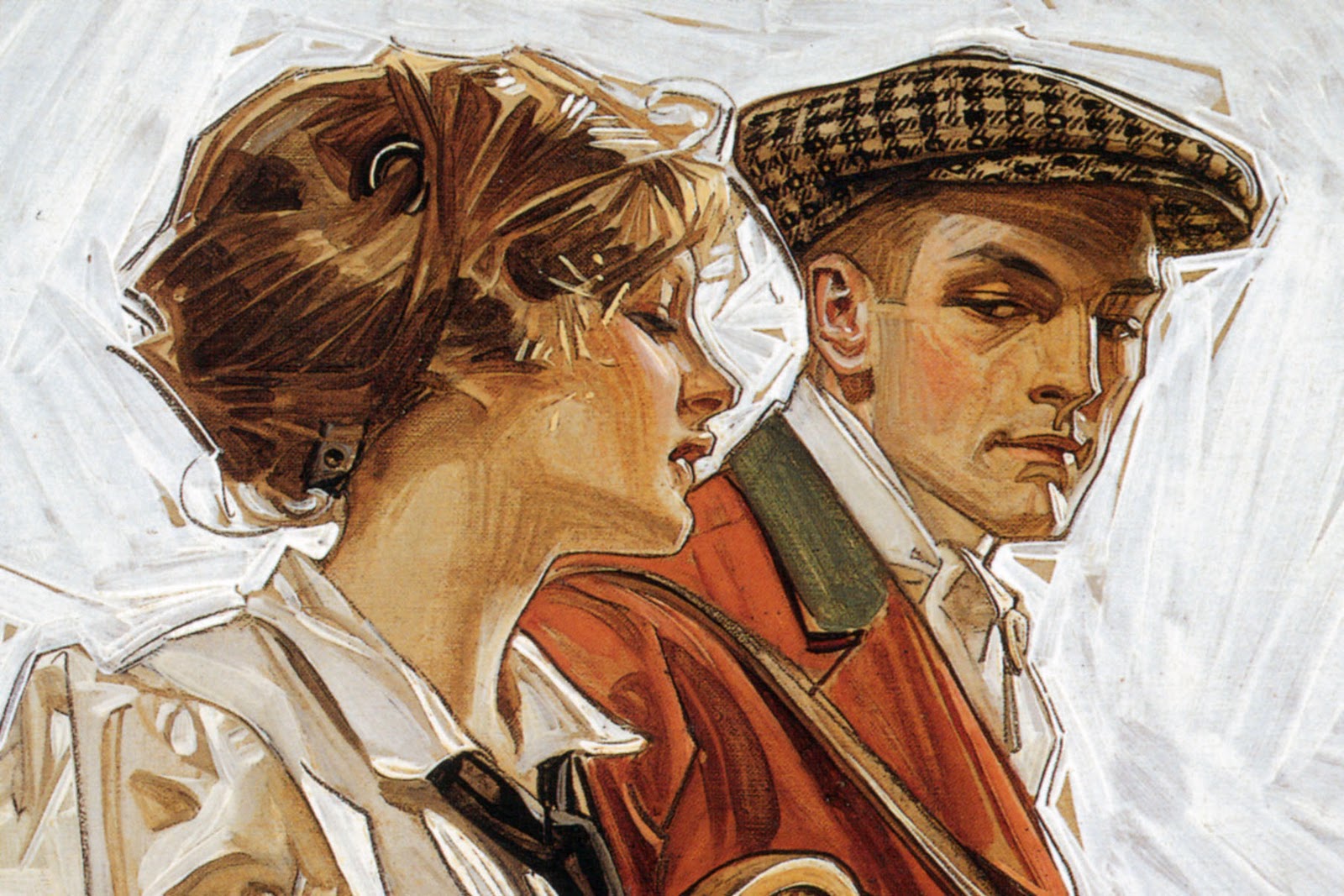
J.C Leyendecker - Influencial Flash in the Pan

An early 20th century Illustrator for The Saturday Evening Post and Kelloggs cereal, his art became a common sight in modern forms of advertising in america.

J.C Leyendeckers distinct art style grabbed him the chance to advertise Arrow Collar Man and Kuppenheimer Suits the clothing to define the ideal american make of the era. Modern advertising had come into its own and Leyendecker was highly regarded in the commercial artist world. 

His fame was short lived as the 1929 economic crash approached and the suit and tie business popularity declined after 1921 and his commissions soon disappeared as the editor of the Saturday Evening Post was replaced. His work was a product of his time which gives a good sense of era.